Optimizing AWS ECS
Optimizing AWS ECS
#380800
Overview
In AWS ECS, the basic unit of a deployment is a task, a logical construct that models one or more containers. This means that the ECS APIs operate on tasks rather than individual containers. In ECS, you do not run a container, but rather, you run a task, which, in turn, runs your container(s). A task contains one or more containers. Currently Densify's ECS solution is based on the existing Kubernetes model. In this data model, ECS services and tasks can be likened to Kubernetes replica sets and pods, respectively.
When deploying the initial release of the ECS optimization solution be aware of the following:
- The Densify UI displays the current and recommended task/container CPU and memory settings using the “analogous” Kubernetes CPU and memory settings: CPU request, CPU limit, memory request and memory limit.
- The current settings need to be mapped to their native ECS settings (i.e. task CPU size, task memory size, per container CPU, per container memory soft limit and hard limits) in order to execute Densify's recommendations.
Contact [email protected] for details of mapping these settings.
Though similar to the Kubernetes dashboards, the charts on this page are specific to ECS services and the column names and options for sorting and filtering differ from the other container dashboards.
ECS costs are dependent on the infrastructure on which your services run.
- When ECS tasks are run on EC2 instances that you own, manage, and pay for, you do not have to pay per-task.
- When you use serverless Fargate environments for containers that are fully managed by AWS then are charged for tasks that are run. To minimize cloud costs and eliminate risks you want to ensure the containers, their underlying infrastructure and the tasks are sized correctly for your applications.
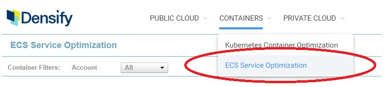
Select ECS Service Optimization from the Containers menu to review the optimization opportunities that Densify has identified for your environments. This menu item is only displayed when you have collected and loaded ECS utilization data. Contact [email protected] for details.
The data on this dashboard is displayed on two tabs:
- Summary—Provides an overview of your ECS environment.
- Data—Provides detailed tabular view of your data. You can dynamically group the data by various attributes, search and hide columns in the table.
You can access additional details using the links on the Summary or Data tabs:
- Analysis—Provides a set of histograms that allow you to visualize your analysis results. You can reach this page using the Services hyperlink on the Summary tab
- Details—Provides details of requests and limits for both CPU and memory and the proposed optimization recommendation. You can reach this page using the hyperlink on the Summary tab or the Data tab.
Note: Services with "Optimization Type=No Data" are filtered out from all of the reports on all ECS tabs.
Using the Container Filter
You can apply various filters to customize the scope of containers you are reviewing. See
Collecting ECS Utilization Data
ECS data is acquired with Densify's standard CloudWatch data collection. See
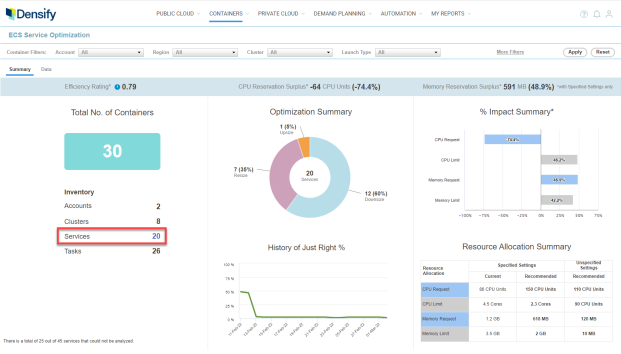
The summary overview provides a number of charts and tables to show you potential savings in your container environments. Values are shown as surplus or deficit of resources rather than monetary savings.
Key metrics are displayed in a banner at the top of the report.
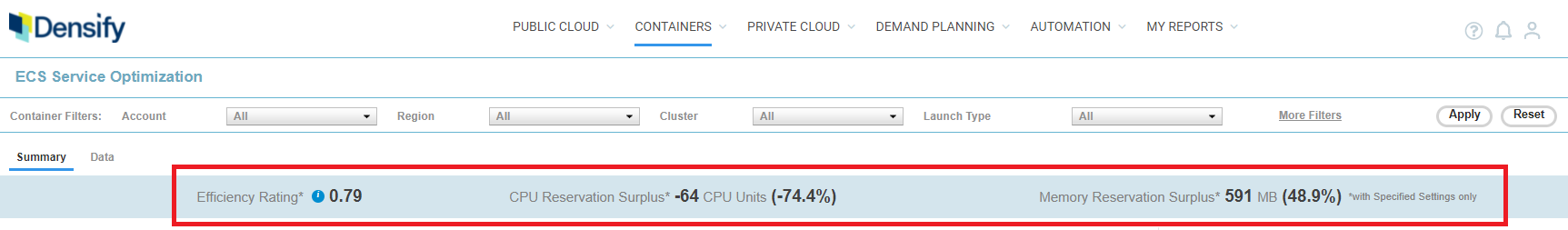
Table: Summary Banner Key Metrics
|
Column |
Description |
|---|---|
|
Efficiency Rating |
The Efficiency Rating provides an indication of the health of your aggregated environment. The value is indicated in red, when it is greater than 1.
|
|
CPU Reservation Surplus (CPU Units) and Percentage |
This is the aggregated total CPU | Memory reservation surplus or deficit in CPU units or GB. The values are also shown as a percentage. This is calculated as (Current CPU or Memory Reservation - Recommended CPU or Memory Reservation ) * Current Count) of the services in the filtered list. The percentage is calculated as (Surplus/Current value) * 100. ECS Services with unspecified CPU | Memory reservations are excluded from these metrics. Surplus and Surplus% can be a negative or positive value, where a negative value indicates a resource deficit. When working with these reports, keep in mind that a reservation is the amount of CPU or memory resources that the system will guarantee for the container. The asterisk (*), on these values as well as on the % Impact Summary bar chart, indicates that these values do not include services with reservations set to "Unspecified". Since the ECS services are sized based on availability of resources, it is not meaningful to compare them to services with defined reservation values. The last column in the Resource Allocation Summary table provides a summary of the containers with Unspecified Settings. |
|
Memory Request Surplus (GB) and Percentage |
The total number of containers is calculated as Number of Tasks * Number of Containers defined in each task.
This table shows you the total number of containers within the analyzed environments. Inventory is broken down by total counts for accounts, clusters, services and tasks are listed. The count for Services is provided as a link. Click the value to navigate to the Analysis tab where you can view your allocation data as series of histograms.
A footnote at the bottom, shows you the number of containers that have not been analyzed because no data has been acquired. If you have applied any filters then the footnote is not displayed as some ECS services are now excluded as they do not meet the filtering requirements, even though they do have adequate data.
This pie chart shows the breakdown of service recommendations by Optimization Type: upsize, downsize, resize, size from unspecified. See Container Optimization Types for descriptions of the various recommendation types.
The line chart shows the number of services that are sized correctly over time. The x-axis scales based on the amount of data up to the maximum of 6 months.
Just Right % is calculated as the number of Services that re "Just Right" out of the all the analyzed services that existed on each day. Any applied filters affect the number of analyzed services. Additionally, services with no data are not included.
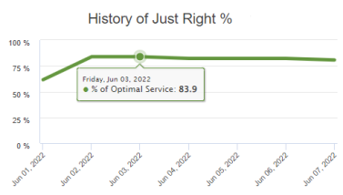
Hover over any data point in the graph to see a popup showing the percentage of systems that are "Just Right" and the date. As you apply the recommendations, the number of right-sized services should increase over time.
If there is no historical data or if all services have been filtered out, this chart is not displayed and you will see a "No Data Available" message.
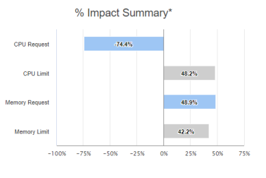
This bar chart shows the potential percentage improvement in container resource allocations when the Densify recommendations have been actioned. A negative value indicates a resource deficit.
The asterisk indicates that only container services that have specified resource allocations are included in this chart.
The table at the bottom shows the current settings and the recommended settings for both CPU and memory. Values are aggregated to show the total increase or decrease of required resources.
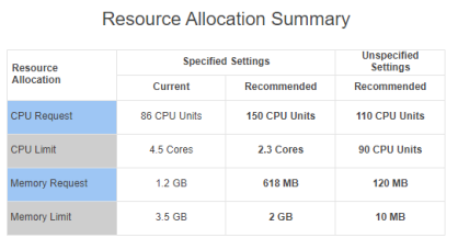
In this table, the values are converted automatically to the next larger or smaller unit, so that values are easy to read:
- MB > GB > TB > PB (each step is divided by 1,024);
- mCores > Cores> KCores > MCores (each step is divided by 1000).
A dash (—) is used to indicate there is no value or that relevant services have been filtered out.
Page Navigation
When there are more rows than can be displayed in a single page, pagination links are displayed in the upper left corner of the page. Click the link to move to the next page. Use these page links to navigate between pages of the report.
Click the Back ( ) button, in the top-right corner of the page, to return to the parent dashboard. Do not use the browser's Back button for navigation within Densify. You will be logged out of your session. See