Optimizing Your Containers - Analysis Tab
Optimizing Your Containers - Analysis Tab
#380780
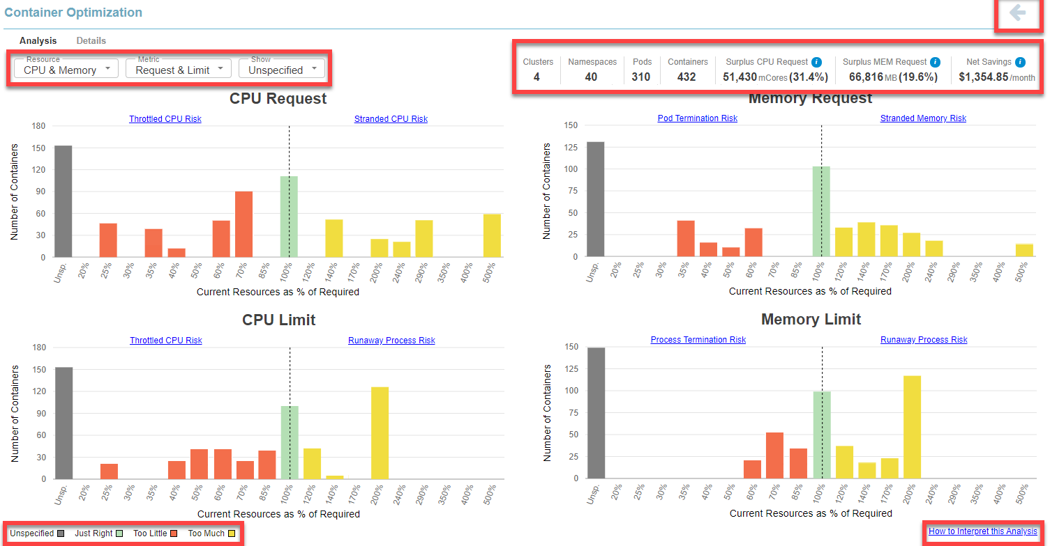
The Analysis tab displays the histogram![]() A histogram is a graphical representation that organizes a group of data points into defined ranges or buckets. Similar in appearance to a bar graph, the histogram condenses a large set of data into an easily interpreted visualization. data that allows you to visualize analysis results for customizable groupings of containers.
A histogram is a graphical representation that organizes a group of data points into defined ranges or buckets. Similar in appearance to a bar graph, the histogram condenses a large set of data into an easily interpreted visualization. data that allows you to visualize analysis results for customizable groupings of containers.
Viewing the Histograms
Access the Kubernetes Analysis tab using the following links:
- Containers Overview > Summary tab > Container Manifest hyperlink
- Containers Overview > Data tab > Container Manifest hyperlinks in the top pane
Page Navigation
Use the breadcrumbs in the upper left corner or click the Back button, in the top-right corner of the page, to return to the parent dashboard. Do not use the browser's Back button for navigation within Densify. You will be logged out of your session. See
Running Totals
Running totals of the entities and the key metrics are displayed at the top right of the report. See Summary Corner for details of key metrics for your container manifests.
If you have applied filters the totals displayed in this summary reflect the filtered results. The values are not affected by the Group By feature.
Grouping and Filtering Your Container Data
You can apply various filters to customize the scope of containers you are reviewing. See
When you export the content of a report with filters applied, the filtered set of systems is exported for the Data and Details tabs.
You can also group and filter your data on the Data tab to obtain the desired data set. See
Data Controls
This tab provides 3 options for viewing your data. The following controls are applicable to the charts on this tab only. By default, when you access this page from the Summary or the Data tab, all 4 charts are displayed with the option to view containers with Unspecified values, enabled.
|
Control |
Description |
|
CPU & Memory |
Select whether you want to review CPU, memory or both CPU and memory. |
|
Metric |
Select whether you want to review request values, limit values or both requests and limits. |
|
Show |
Unspecified—You can indicate whether or not to include containers with unspecified values. When enabled, the grey bar indicates the number of containers with unspecified values. If, for example, both the CPU Request and Limit values are unspecified for a container manifest, this will contribute to the unspecified count in both the CPU Request and CPU Limit charts. If only the CPU Limit value is unspecified then only the unspecified count on the CPU Limit chart is incremented. |
Histogram Charts
These histogram![]() A histogram is a graphical representation that organizes a group of data points into defined ranges or buckets. Similar in appearance to a bar graph, the histogram condenses a large set of data into an easily interpreted visualization. charts show your select data grouped as a distribution. The scope of data, is defined by any filters you have applied.
A histogram is a graphical representation that organizes a group of data points into defined ranges or buckets. Similar in appearance to a bar graph, the histogram condenses a large set of data into an easily interpreted visualization. charts show your select data grouped as a distribution. The scope of data, is defined by any filters you have applied.
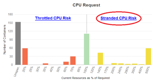
Based on Densify's analysis of your container environments, sizing recommendations are generated and the container is determined to be at risk, just right or oversized. Each container manifest is then placed into a "bucket", based on how close its allocation is from the optimal configuration. The histogram shows you how many containers/pods (Y-axis) are in each of these buckets that are displayed along the X-axis. The current resource allocation, as a percentage of what is actually required, make up these buckets on the X-axis.
The data is shown on the chart as follows:
- Containers identified with less than optimal resource allocation (shortfall) are identified as having between 0 and 99% of their optimal allocation (Current Resources as % of Required < 100%). These containers are shown on the left side of the chart.
- Containers with all of the resources they require are indicated as 100%, or no sizing error.
- Containers with surplus resources are identified as having over 100% of their optimal allocation (Current Resources as % of Required >100%). These containers are shown on the right side of the chart and highlight resources that are stranded, by being committed to pods that are not using them.
- If you have enabled Show > Unspecified, then the number of containers with an unspecified resource request and/or limit value are also shown at the far left of the chart.
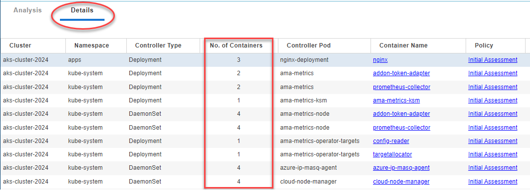
The number of containers in each bucket, the percent shortfall and percent surplus is calculated for each container manifest which is then multiplied by the number of containers covered by the manifest. The Details tab shows a line for each container manifest and from that tab you can see the number of containers shown in the "# of Containers" column.
Additional Features
Use the following additional features on these charts to see the recommendation details:
- Drill down hyperlinks—The zone descriptions are hyperlinks that will take you to the Details tab, that has been sorted to show the relevant systems. For example, if you click Throttled CPU Risk, the Details tab opens and the tabular data will be sorted to show the systems with a CPU shortfall at the top of the list.
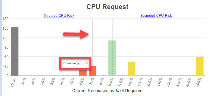
- Hover-over bucket contents—When reviewing the charts, you can hover over any of the bars to see how many containers are in the selected bucket. For improved clarity, a grey line indicates which bar the pop up value is associated with.
Slideshow: Interpreting Histograms
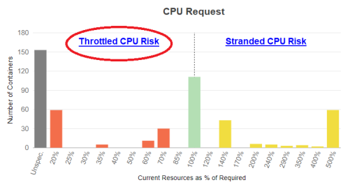
Throttled CPU Risk
Details Tab - Sorted on Surplus CPU Request
showing containers at risk of throttled CPU resources
Stranded CPU Risk
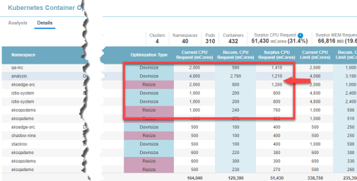
Details Tab - Sorted on Surplus CPU Request
showing containers with Stranded CPU resources
In the example below there are 30 containers at 70% of the required resources.
CPU Request
The CPU Request is the number of CPU millicores (mCores) that are guaranteed for the container. If a container CPU request is specified then Kubernetes will only schedule it on a node that can provide the requested CPU resources.
Applications in containers on the left side of the histogram may experience CPU throttling and the resulting performance issues.
Containers on the right side of the chart indicate containers with over-allocated CPU resources, resulting in stranded capacity. Since the request guarantees these resource to the container, they cannot be re-allocated until the pod shuts down.
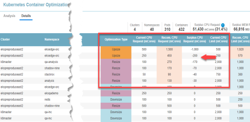
Click the zone description to review specific details of the recommended resource allocations to improve container and/or application performance. Clicking "Throttled CPU Risk", will switch to the Details tab and display the table sorted on the "Surplus CPU Request" column in ascending order (with the negative values shown at top of the list). From here you can review the details of the recommended allocation changes for each manifest.
Clicking the "Stranded CPU Risk", will display the Details tab sorted on the "Surplus CPU Request " column in descending order with the largest positive values shown at top of the list. Systems with unspecified values are indicated with a dash (-) and are shown first so you may need to scroll down to see the manifests with stranded CPU resources.
CPU Limit
The CPU limit is the maximum allocation that a pod or container can access. When you specify a resource limit, Kubernetes enforces the limit so that the running container cannot use more CPUs than the defined limit.
If the limit has not been set, it is possible for a container to use more resources than it requests, if the node has available CPUs. However, a container is not allowed to use more than its resource limit. In this case, applications in containers on the left side of the histogram will likely experience performance issues due to CPU throttling.
Click the zone description to switch to the Details tab for details of the specific recommended resource allocations to improve container and/or application performance. The table will be sorted on the "CPU Request Surplus" column in ascending order (with the negative values shown at top of the list). From here you review the details of the recommended allocation changes.
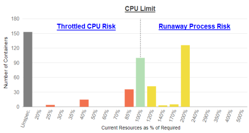
Containers on the right side of the chart indicate containers with over-allocated CPU resources, resulting in stranded capacity. If the limit is set too high and runaway processes exceed their request and hit the limit for sustained periods, the CPUs cannot be re-allocated until the runaway processes are terminated or the pod shuts down. This will again, result in stranded CPU capacity.
Memory Request
Like the CPU Request, a memory request is the amount of memory that is guaranteed for the container. If a container memory request is specified then Kubernetes will only schedule it on a node that can provide the allocated resources.
Applications in containers on the left side of the histogram may run out of memory resulting in performance issues or the pod may be terminated due to insufficient available memory.
Containers on the right side of the chart indicate containers with over-allocated memory resources, resulting in stranded capacity. Since the request guarantees these resource, they cannot be re-allocated until the pod or task shuts down.
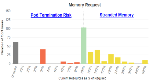
Click the zone description to switch to the Details tab for details of the specific recommended resource allocations to improve container and/or application performance.
Memory Limit
The memory limit is the maximum allocation that a pod or container can access. When you specify a resource limit, Kubernetes enforces the limit so that the running container cannot use more memory than the defined limit.
If the limit has not been set, it is possible for a container to use more resources than its request if the node has available memory. However, a container is not allowed to use more than its resource limit. When a process in the container tries to consume more than the allowed amount of memory, the system terminates the process that attempted the allocation, with an out of memory (OOM) error.
Containers on the right side of the chart indicate containers with over-allocated memory resources, resulting in stranded capacity. If the limit is set too high and runaway processes exceed their request value for sustained periods, the memory cannot be re-allocated until the runaway processes are terminated or the pod shuts down, thereby stranding memory resources.
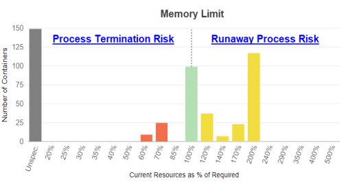
Click the zone description to open the Details tab for details of the specific recommended resource allocations to improve container and/or application performance.