Understanding the Instance Optimization Details Report
Understanding the Instance Optimization Details Report
#380390
The Instance Optimization Details report displays instance-specific details for the instance type group selected from an optimization opportunity or Public Cloud Overview report.
Open the Instance Optimization Details report, by clicking on a hyperlinked value in the Count column from a supported optimization opportunity tabular report.
The Instance Optimization Details report for ASGs is covered in
Note: Cloud instances that do not have adequate information for recommendation analysis are not included in the Instance Optimization Details report. For example, this would include guests with no or incomplete benchmark data.
Recommendations are based on the latest cloud catalogs from the supported public cloud providers.
Page Navigation
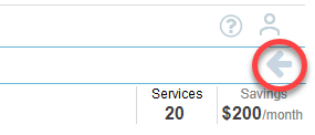
Use the breadcrumbs in the upper left corner or click the Back button, in the top-right corner of the page, to return to the parent dashboard. Do not use the browser's Back button for navigation within Densify. You will be logged out of your session. See
The Instance Optimization Details dashboard consists of:
- A tabular report—The columns of the tabular report change depending on the selected instance type. Refer to the Table: Instance Optimization Details Tabular Report Columns below for details. See Data Controls, below to search, sort, export and customize the table's content.
- A lower pane with system details—Based on the selected system in the tabular top pane, various details and settings for the system are available in separate tabs, such as system resource utilization charts, system details, optimization approvals and modifying system attributes. See Reviewing Specific Instance Details for details on each tab.
Reviewing the Instance Optimization Details Table
Summary Bar
A summary bar showing the number of services and potentials savings is displayed at the top of the page. These values relate only to the content of the details page and not your total environment.
The controls, in the upper right corner of the page, provide options for managing and viewing your data more effectively. See Data Controls on Tabular Reports for more details.
Tabular Report
The columns of the tabular report change depending on the selected instance type. Refer to the table below for details. See Data Controls, above to search, sort, export and customize the table's content.
|
Component/ |
Description |
Included For |
||||||
|---|---|---|---|---|---|---|---|---|
|
Account | Project | Subscription |
The instance's parent environment. This corresponds to the:
|
|
||||||
|
Availability Zone |
The cluster/availability zone that corresponds to a geographic region. |
|
||||||
|
System |
The system name is a hyperlink that opens the Catalog Map page. You can also access the Metrics Viewer. |
|
||||||
|
System ID |
A unique key assigned by the public cloud vendors to identify this instance. |
|
||||||
|
Identifies the overall status of the optimization results based on Optimization Type and potential $ Savings/Month :
This column is hidden by default. You can enable it for display, as required. See Data Controls, above. |
|
|||||||
|
The recommended action for this instance. See Optimization Type Descriptions and Color-Coding for a description of each recommendation. |
|
|||||||
|
Recommendation Reason/Observations |
The reason for the Optimization Type recommendation. Densify also provides any relevant details related to the recommendation. |
|
||||||
|
Current Instance Type |
Based on the data collected, the current instance type is listed. |
|
||||||
|
Recommended Instance Type |
Based on optimization analysis, the recommended catalog instance type is listed. |
|
||||||
|
When using pay-per-use pricing models, the amount of time each instance has been running, is required to accurately estimate future costs. The predicted uptime (%) for a cloud instance or container, is based on the percentage of hours CPU utilization data is present in the historical interval, as specified in the policy settings for the entity. For Auto Scaling groups and VM Scale Sets and Individual child instances are not taken into account. Predicted uptime %, for new instances or containers, that started mid-way through the historical interval, is calculated from the time/date that the instance was started as opposed to the beginning of the interval, resulting in more accurate predictions for future usage. For example, the uptime is the number of hours that have "CPU Utilization in mcores", and the range is the lesser of when the container was discovered, or the range defined in the policy. Looking at a specific container that was discovered on Jan 5th 2024, that has workload of 42 hours since that date, then the uptime % is 42 hrs/(13 days x 24 hrs/day) = 13.4%. This is the value shown in this column. Click on the Predicted Uptime Details tab to review the uptime details for the selected instance. |
|
|||||||
|
The current estimated per instance cost is determined by multiplying the on-demand, monthly price of the current instance type by predicted uptime %. i.e. current per instance list price (monthly)* predicted uptime % See FAQs for examples of how the costs are calculated. |
|
|||||||
|
Recommended estimated cost is calculated based on multiplying the on-demand price of the recommended instance type by the uptime. This column is hidden by default. You can enable it for display, as required. See Data Controls, above. |
|
|||||||
|
The estimated current and recommended instance cost is used to calculate savings per month (i.e. current estimated cost - recommended estimated cost). |
|
|||||||
|
[Moderate|Low|Very Low|None] This column describes the effort required to investigate and implement the Densify recommendations. Effort for each instance is calculated by rule-driven analytics based on factors (such as instance family change, storage change, data quality checks, feature changes, etc.) that can be configured in the policy settings and rule set which captures best practices. Click on the Effort Details tab to view the factors that contribute to the effort level. See Reviewing the Workload Charts and Additional Details Tabs, below. |
|
|||||||
|
Current CPU |
The current value for CPU allocation. |
|
||||||
|
Recommended CPU |
The recommended value for CPU allocation. |
|
||||||
|
Current CPU Benchmark |
The CPU benchmark for the current instance type. This column is hidden by default. You can enable it for display, as required. See Data Controls, above. |
|
||||||
|
Recommended CPU Benchmark |
The CPU benchmark for the recommended instance type. This column is hidden by default. You can enable it for display, as required. See Data Controls, above. |
|
||||||
|
Current Memory Allocation (GB) |
The current value for memory allocation. |
|
||||||
|
Recommended Memory Allocation (GB) |
The recommended value for memory allocation. |
|
||||||
|
CPU Usage (%) |
[PD-55365] The percentage of CPU allocation that is used by the workload. |
|
||||||
|
Active Memory Usage (%) |
The percentage of active memory utilization. |
|
||||||
|
Memory Usage (%) |
The percentage of memory utilization. |
|
||||||
|
OS |
The operating system running on the instance. |
|
||||||
|
Ideal CPU Allocation |
The minimum CPU allocation required to not violate the policy high limits on the recommended instance. This column is hidden by default. You can enable it for display, as required. See Data Controls, above. |
|
||||||
|
Ideal Memory Allocation |
The minimum memory allocation required to not violate the policy high limits on the recommended instance. This column is hidden by default. You can enable it for display, as required. See Data Controls, above. |
|
||||||
|
CPU Allocation Efficiency (%) |
The allocation CPU efficiency (i.e. ideal allocation / recommended allocation) is measured in percent and shows the amount of CPU resources truly require by the workload. This column is hidden by default. You can enable it for display, as required. See Data Controls, above. |
|
||||||
|
Memory Allocation Efficiency (%) |
The allocation memory efficiency (i.e. ideal allocation / recommended allocation) is measured in percent and shows the amount of memory resources truly require by the workload. This column is hidden by default. You can enable it for display, as required. See Data Controls, above. |
|
||||||
|
A value in this column indicates the instance type has been changed recently. The workload for this instance, on which the recommendation is based, includes only the days of data from the indicated date to the current date. All historical data for this instance, collected prior to the indicated date is not included in the analysis. Previous data has been excluded because it was based on the previous instance type. A blank cell indicates the current instance type has not changed and all available workload data within the range, defined by the policy, has been used to generate the recommendation. Contact [email protected] to enable this feature. See Relearning Workload Patterns for more details. |
|
|||||||
|
Summary Total |
In the top-right of the tabular report, the total number of Instances and Savings/Month for implementing the recommendations are displayed. The total number of instances displayed is a total of all the instances in the optimization instance type group. This number corresponds to the number in the Count column of the parent optimization opportunity tabular report. The amount of savings per month is a sum of all the monthly savings for each instance listed and can be negative if the recommendation is an upsize or upsize to an optimal family. |
|
Note: The following details are not included in this report: Disk Allocations (Current | Recommended), Individual Disk Partitions at Risk, Disk Usage and Parent.
Optimization Type Descriptions and Color-Coding
The following descriptions and color coding apply to all AWS, Azure and GCP tabs.
Note: Not all optimization types are supported for all cloud providers.
|
Optimization Type |
Description |
|---|---|
|
Just Right |
This instance is optimally sized for the workload. |
|
In general the following upsize recommendations incur additional costs. The cost increase is determined by comparing on-demand pricing for the current and recommended instance. The increased cost is required to alleviate application risk. If you have an RI or SP for the recommended upsize instance, there could be cost savings. This would still be an upsize recommendation. |
|
|
Upsize - Optimal Family |
This instance should be upsized to a more optimal instance family. This will improve the workload's performance and reduce risk. If the workload can be moved to larger instance in a different family and still reduce cost, this then becomes a Modernize recommendation. e.g. t2.medium-Linux to m3.medium-Linux |
|
Upsize |
This instance should be upsized to an instance within the same instance family. The hosted workload needs an instance with more CPU and\or memory resources. e.g. r3.large to r4.xlarge, both are in the "Memory Optimized r" instance family. |
|
Upscale |
This recommendation applies to ASGs only and indicates the ASG needs increase compute capacity by adjusting the maximum group size. It may be more cost effective to use a larger instance for this ASG. |
|
Downsize recommendations reduce the allocated resources as your workload has likely been over-provisioned. Once the recommendation has been determined from CPU and memory utilization, it is further verified against policy-defined limits, before the downsize or terminate recommendations are made. |
|
|
Terminate |
This instance should be terminated, as it is idle. An instance is determined to be idle if it has very low CPU utilization, network and disk I/O over an extended period of time. This will save you money. |
|
Downsize - Optimal Family |
This instance should be downsized to an instance belonging to an instance family that more closely suits your workload's utilization. When you downsize, CPU and\or memory will be decreased to better suit your workloads. Utilization will improve with no impact on performance. This will save you money. e.g. d2.medium-Linux to m4.medium-Linux |
|
Downsize |
This instance should be downsized to an instance within the same instance family. As indicated above, CPU and\or memory will be decreased to better suit your workloads. Utilization will improve with no impact on performance. This will save you money. e.g. m3.large-Linux to m3.small-Linux |
|
Downscale |
ThisAuto Scaling group or VM Scale Set should be downscaled to decrease the compute capacity by adjusting the minimum group size. |
|
The following modernize recommendations move your workload to a more modern instance type without changing the resource allocation, cost or performance, at a minimum. Your costs could decrease and/or you may benefit from potential utilization and performance improvements. |
|
|
Modernize - Optimal Family |
This instance should be modernized to an instance belonging to a more optimal instance family. The cost of the new instance type will be less than the existing cost. Allocated resources are not being removed and moving to an instance with more current hardware, you may also benefit potential utilization and performance improvements. When you modernize, you will not decrease performance but will decrease cost. |
|
Modernize |
This instance should be modernized to an instance within the same instance family. The cost of the new instance type will be less than the existing cost and as indicated above you may also get utilization and performance improvements. For example, moving to a new generation of the same instance family (e.g. m3.large to m4.large). |
Reviewing Specific Instance Details
Clicking on any row in the tabular report shows more detailed system information for that instance, in the 4 tabs, on the lower pane:
- Metrics Viewer—The link on the left side of the lower pane, opens the metrics viewer. You can use the metrics viewer to investigate details when deciding whether to action specific recommendations. See
- Catalog Map—This link opens the Analysis Details page showing the chart displaying the available recommendation options for the selected instance. See
- Analysis Report—This link opens Impact Analysis and Recommendation Report report. See
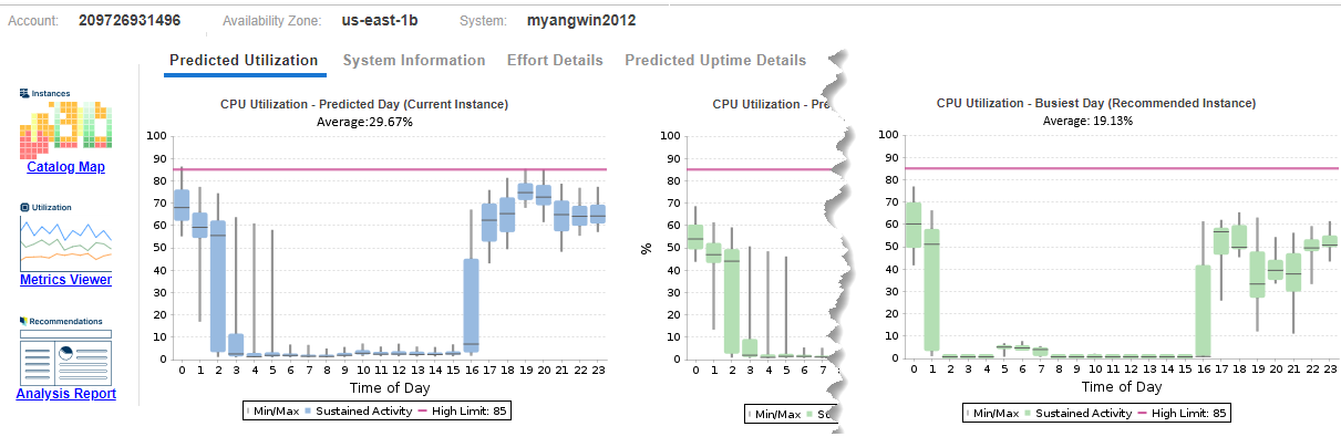
- Resource Utilization Metrics: Cloud Tab—The charts on this tab show the utilization for various workloads for the selected instance.
- System Information Tab—Click on this tab to see allocated resources and some of the organizational attributes that have been set for this guest.
- Effort Details Tab—This tab lists the factors that contribute to the effort required to investigate and implement the Densify recommendations. Effort for each instance is calculated by rule-driven analytics based on factors (such as instance family change, storage change, data quality checks, feature changes, etc.) that can be configured in the policy settings and through analysis rule sets. A description of each rule/property and its impact on the effort to move the current instance to the recommended instance type are provided.
- Predicted Uptime Details Tab—This tab shows a pie chart with the uptime details for the selected instance.
Note: The catalog map is not currently available for AWS ASGs or GCP instances.
Note: If no metrics are available, then the corresponding chart is not displayed.
If a cloud instance has been optimized (i.e. instance type has been changed based on a recommendation), then on the next day you will see the Optimization Type set to "Just Right" and since the required data (as defined by the policy) has not been accumulated, only the Memory BackFill workload chart is displayed, if enabled. See the column, Instance Type Updated On , above for more details.
These workload charts show hourly min/max and sustained activity for the selected system. Use the left/right arrows to scroll though the various workload charts.
Workload charts show current Sustained Activity in blue, while Sustained Activity on the recommended instance type is shown in green.
Note: When reviewing Optimal and Terminate recommendations the recommended instance type (green) is not applicable and so is not shown.
The minimum and maximum utilization values are shown as vertical lines above and below the coloured block. The median is indicated as a black line within the coloured block. The average is indicated in brackets, in the sub-title of the chart.
The scale used on the Y-axis is scaled dynamically to match the range of data. Where applicable, the pink line indicating the policy high limit, is shown, and the setting of the Y-axis scale also accounts for the policy limit setting.
Contact [email protected] for further details on the policy settings and rule set configured for your environment.
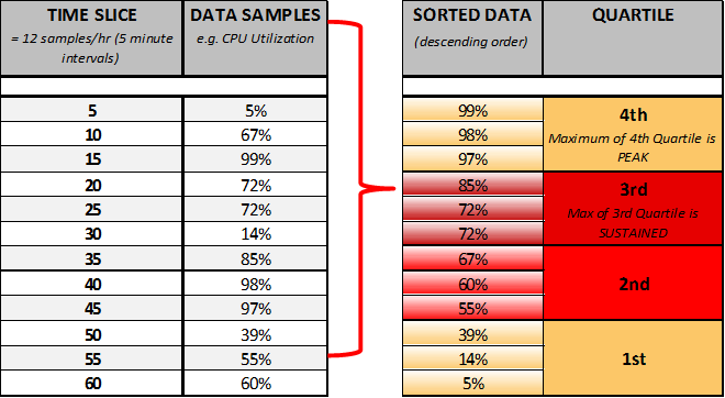
Quartiles in the Resource Utilization Charts
In charts, workload data for each system is shown in four different bars (two yellow and two red), called quartiles, to show minimum, average, sustained and peak values. When used in the analysis, quartiles provide a good representation of system activity because the weighted scoring for sustained and peak activity produces a more accurate assessment of workload utilization patterns and requirements.
Quartiles are calculated in the following manner:
- Workload activity is collected every five minutes, which totals 12 times per hour.
- The 12 values are then re-ordered in descending order and separated into equal sample sizes (quartiles), with each quartile having three values. Each quartile represents 25% of operational time.
- The bottom of the first quartile shows the minimum value, the next quartile shows average values, the top of the third quartile shows the sustained value and the top of the fourth quartile shows the peak value.