DCE Workload Viewer
DCE Workload Viewer
#171390
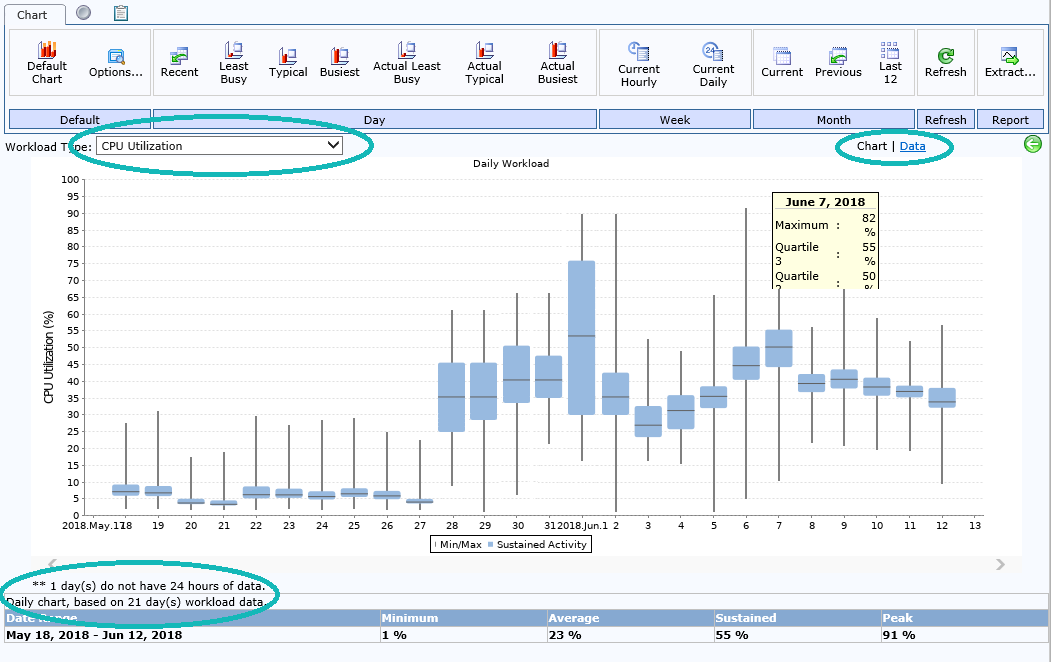
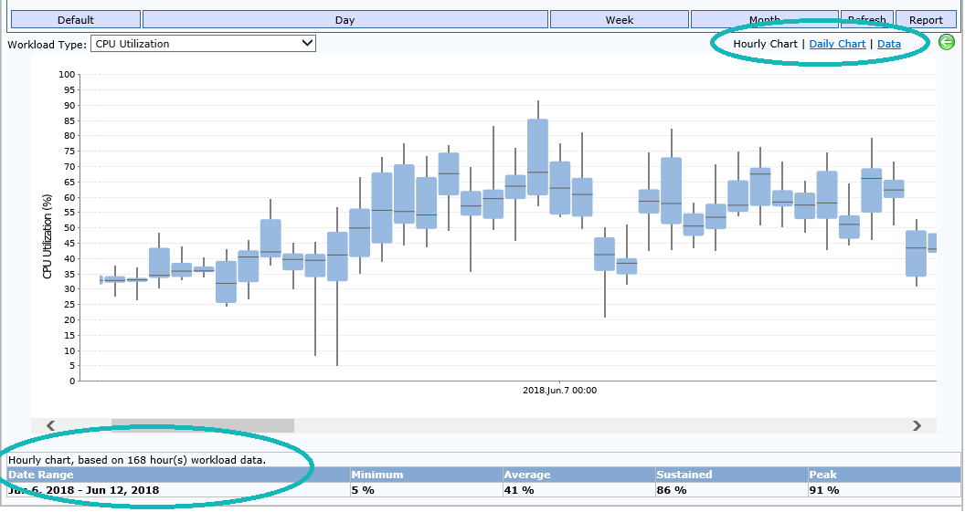
The workload viewer provides historical utilization tracking as well as forward-looking growth estimates based on historical workload patterns. In the chart, each column shows the distribution of workload measurements within the four quartiles for each hour or day (depending on the option selected). The 1st (Minimum), 2nd (Average), and 3rd (Sustained) quartiles combined, represent 75% of operational time. The last quartile is the maximum or peak value.
Note: When using the simplified version of the Control Console in browsers other than Internet Explorer some features may not be available. See
A simplified version of the workload viewer is provided with the cross-browser compatible version of the Control Console.
The following features are available for advanced users when using a supported version of Internet Explorer:
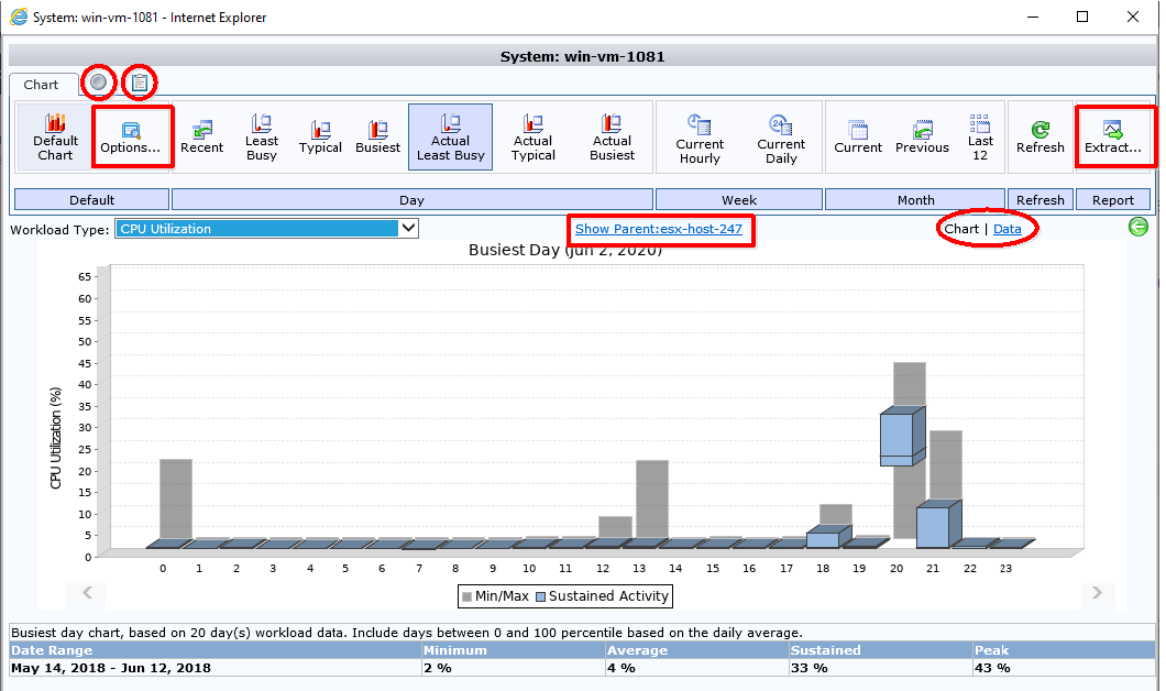
- Disable Toolbar button—The button, located above the toolbar that toggles the toolbar on or off.
- Copy to Clipboard button—The copy button, located above the toolbar that copies the displayed workload data to the clipboard.
- Options Button—The Options button, located in the Default tab, that opens the Workload Range Selection dialog box. By default, the workload viewer options are set from the analysis settings, as defined in the policy that is associated with the selected environment.
- Extract Button—The Extract button, located at the end of the toolbar, used to extract the selected workload data to a .CSV file;
- Hierarchy Link—The link, located at the top of the chart, showing the selected system's hierarchy (parent or child system(s);
- In the upper right corner the option to view data in tabular format i.e. (Chart | Data).
To display the workload viewer:
- In the Analysis Console, navigate to Analysis Workbench > Data Center Explorer.
- Then navigate to the applicable systems by selecting the applicable view from the Views dropdown and by applying an optional filter from the Filters dropdown.
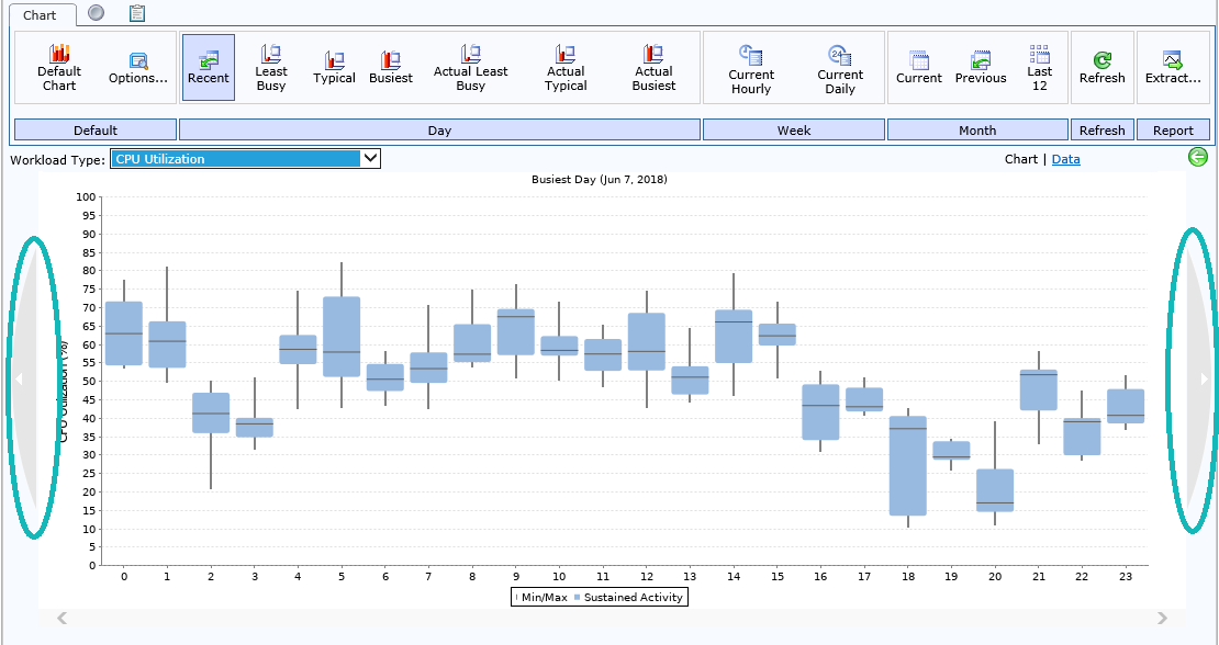
- Select one or more systems and click the Viewer button in the Workload category of the dashboard toolbar. The Default Chart dialog box is displayed.
- You can hover over a bar to see the exact values. You have the following options for chart data:
- The Hourly Chart shows hourly utilization for the time frame specified in the Workload Range Selection dialog box (to a maximum of the last seven days). If you have more than 7 calendar days selected, you will only see a Chart option.
- The Daily Chart shows daily utilization for the time frame specified in the Workload Range Selection dialog box. If you have more than 7 calendar days selected, you will only see a Chart option.
- The Data option displays the data values in a table for each day of collected data.
- You can move the chart data back and forward in history by clicking the arrows on the right or left side of the chart.
Note: You can also open the Workload Viewer from the Control Console—after clicking a host or VM, click the Workload Viewer button in the lower-right area of the Control Console.
Note: Calculations are different between daily and hourly charts.
You can use the Options toolbar button (click Workload category > Viewer button. The Default Chart is displayed. Click Default category > Options button to edit range settings for workload data (as described in the Chart Tab Buttons below).
You can use the Workload Type list to select a different workload metric (as described in the Workload Type Selection below). The selection you make here, will persist across sessions. Each time you open the viewer will display the selected workload type.
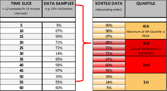
Quartiles in the Workload Viewer
In charts, workload data for each system is shown in four different bars (two yellow and two red), called quartiles, to show minimum, average, sustained and peak values. When used in the analysis, quartiles provide a good representation of system activity because the weighted scoring for sustained and peak activity produces a more accurate assessment of workload utilization patterns and requirements.
Quartiles are calculated in the following manner:
- Workload activity is collected every five minutes, which totals 12 times per hour.
- The 12 values are then re-ordered in descending order and separated into equal sample sizes (quartiles), with each quartile having three values. Each quartile represents 25% of operational time.
- The bottom of the first quartile shows the minimum value, the next quartile shows average values, the top of the third quartile shows the sustained value and the top of the fourth quartile shows the peak value.
Hourly View
Using the hourly view for a single system, the chart and quartiles are calculated in the following manner:
- The first quartile (minimum) shows the value where activity was at or below for 25% of the time for that hour.
- The second quartile (average) shows the value where activity was at or below for 50% of the time for that hour.
- The third quartile (sustained) shows the value where activity was at or below for 75% of the time for the hour.
- The fourth quartile (peak) shows the maximum value for that hour.
If a group of systems is selected in the hourly view and a percentage metric is being calculated (e.g. CPU Utilization or Memory Utilization in Percent), each system is weighted based on its corresponding benchmark rating when the chart is calculated. If using CPU Utilization, multiple CPU benchmarks can be used so the actual benchmark used is displayed at the bottom of the chart. .
Note: If any systems are missing data, the group chart is calculated with the data that is available and a warning about missing data for one or more systems is displayed.
Daily View
The daily view uses a different calculation for minimum/average/sustained/peak values. Using the daily view for a single system, the chart is calculated in the following manner:
- The first quartile (minimum) shows the minimum value of all minimum hourly values for that day.
- The second quartile (average) shows the average for all 2nd quartile hourly values for that day.
- The third quartile (sustained) shows the average for all 3rd quartile hourly values for that day.
- The fourth quartile (peak) shows the maximum value of all maximum hourly values for that day.
If a group of systems is selected in the daily view, and a percentage metric is being calculated (e.g. CPU Utilization or Memory Utilization in Percent), each system is weighted based on its corresponding benchmark rating when the chart is calculated.
Table Data
For both the hourly view and daily view, the table at the bottom of the chart shows the following data:
Minimum: the minimum of all minimum quartile values currently displayed in the chart.
Average: the average of all second quartile (average) values currently displayed in the chart.
Sustained: the maximum of all third quartile (sustained) values currently displayed in the chart.
Peak: the maximum of all fourth quartile (peak) values currently displayed in the chart.

In Workload Type, select the workload type to apply that metric to the systems. Once you select a new workload type, the workload chart changes accordingly.
Although there are many different workload types from which to choose, you should be aware of the Power workload type. Accurate power consumption is a key consideration when designing infrastructure to minimize consumption. Using this workload type, you can analyze both measured and estimated power draw for specific IT systems. System values can then be rolled up for overall utilization for groups of servers and entire data centers.
An Hourly Chart option is available to allow you to identify a potential pattern with a single system that is violating its policy that might be difficult to identify with a daily chart. The Hourly Chart shows data for each hour to a maximum of 7 days. The Hourly Charts option is only available if the Workload Viewer has been set to show 7 days or less of data. This option will not display by default.
- In the Analysis Console, navigate to Analysis Workbench > Data Center Explorer.
- Select the appropriate view and filter to see a list of selected systems.
- On the Info toolbar, click the Viewer button. The Default Chart is displayed.
- In the Chart tab at the top, click the Options button. The Workload Range Selection dialog box opens.
- Select the Last ... calendar days or the Last...days with available data option and enter a number of 7 or fewer days as the amount of data to be shown in the chart and click OK. The Hourly Chart option is now available and the Chart option is now a Daily Chart option.
- Click the Hourly Chart option.
Note: You can also open the Workload Viewer from the Control Console—after clicking a host or VM, click the Workload Viewer button in the lower-right area of the Control Console.
Note: The Hourly Chart option shows hourly data for the timeframe that you specify (if 7 or fewer days) whereas the Current Hourly option shows hourly data for the current week only.
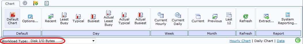
The following buttons are available in the Workload Viewer:
|
Button |
Description |
|---|---|
|
Default |
|
|
|
Displays the default chart (i.e. the initial chart displayed, once you click the Viewer button from the previous screen). Workload information is displayed at the summary level, by means of a chart and a table. You can change the workload type, from the Workload Type dropdown. |
|
|
Displays the Workload Range Selection dialog box in which you can define your workload options. For information on the fields displayed in this dialog box, see Workload Viewer Options. |
|
Day |
|
|
|
Displays a workload chart for the most recent day’s data. |
|
|
Displays a workload chart of the day with the lowest utilization levels from the selected days of workload history. When the chart is for multiple systems, the date is selected independently for each system. |
|
|
Displays a workload chart of a typical day (a day with the median utilization levels) from the selected days of workload history. When the chart is for multiple systems, the date is selected independently for each system. |
|
|
Displays a workload chart of the day with the highest utilization levels from the selected days of workload history. When the chart is for multiple systems, the date is selected independently for each system. |
|
|
Displays a workload chart of the day with the lowest utilization levels from the selected days of workload history. When the chart is for multiple systems, a single common date resulting in the lowest aggregate utilization would be selected. |
|
|
Displays a workload chart of a typical day (a day with the median utilization levels) from the selected days of workload history. When the chart is for multiple systems, a single common date closest to the mean would be used. |
|
|
Displays a workload chart of the day with the highest utilization levels from the selected days of workload history. When the chart is for multiple systems, a single common date resulting in the highest aggregate utilization would be used. |
|
Week |
|
|
|
Clicking this button displays a workload chart showing hourly data for the current week. You can move charts ahead or behind a week by using the arrows at the left and right of the chart. |
|
|
Displays a workload chart showing daily data for the current week. |
|
Month |
|
|
|
Displays a workload chart for the current month’s data. |
|
|
Displays a workload chart for the previous month’s data. |
|
|
Displays a workload chart for the last 12 month’s data for the selected system. You can drill-down on a month column to view that month’s system information. |
|
Refresh |
|
|
|
Refreshes the workload viewer with the most up-to-date workload data. If you have just imported additional workload data for a system to view in the workload viewer, click this button to see the new data in the workload viewer without having to log out of Densify. |
|
Report |
|
|
|
Click this button to access the extract functionality. This allows you to grab raw workload data, export it to, for example, a CSV file and then use it for charge back purposes. |
|
|
Click this button to access the System Reporting functionality. |


Navigating to the Appropriate Date/Time
To navigate to the appropriate date/time, use the left and right arrows appropriately, as indicated below:
Also see the following topics: